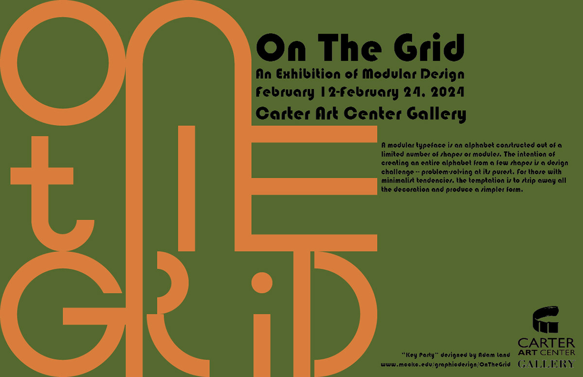
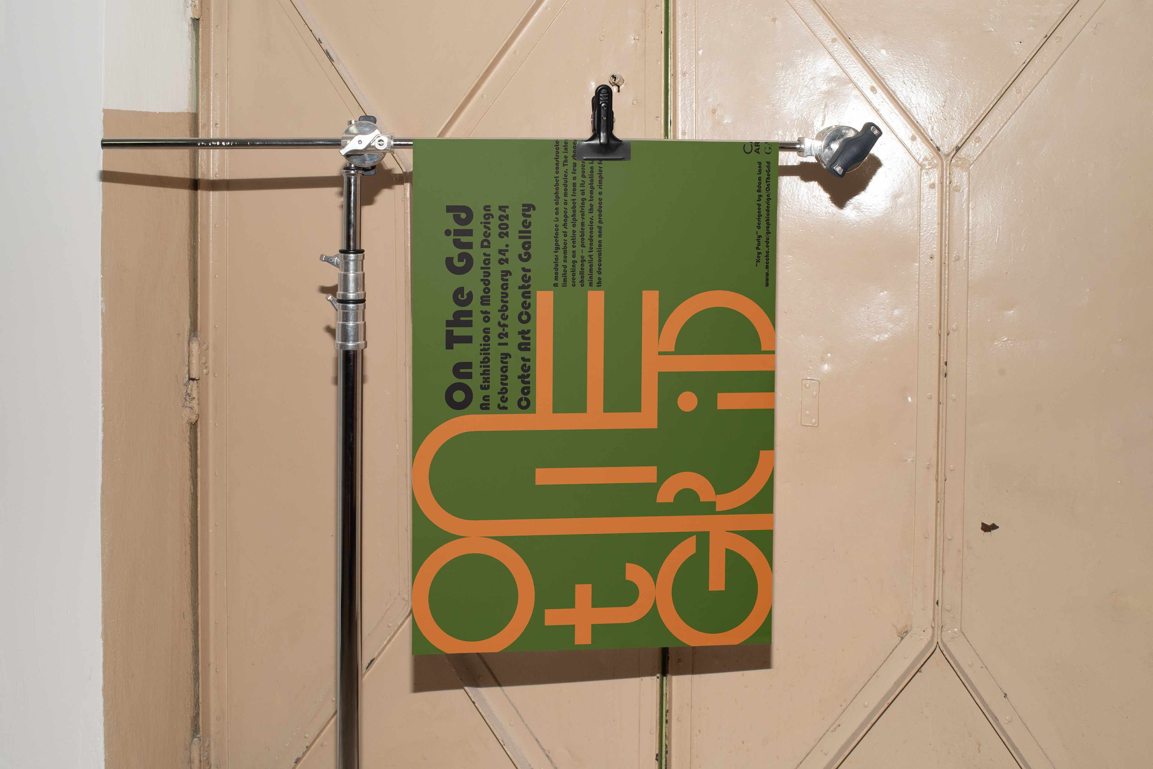
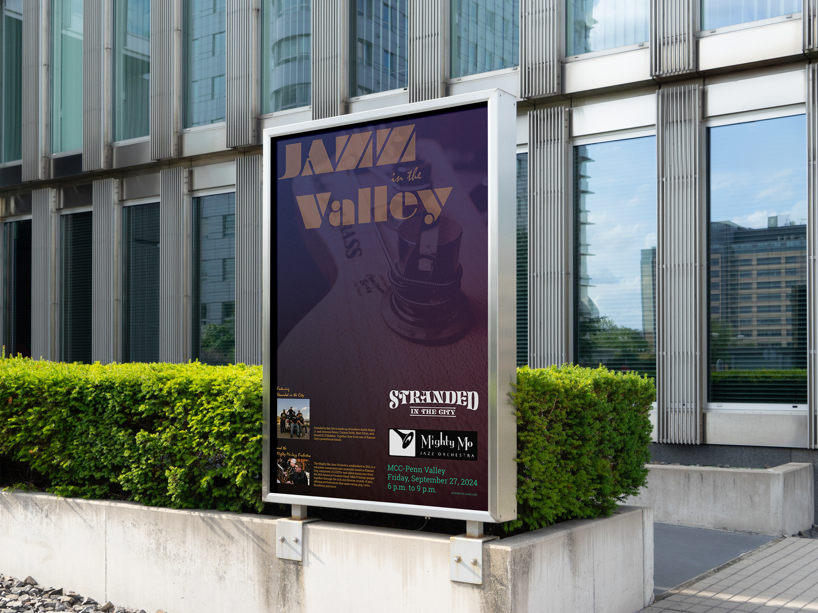
This was a really fun project to work on. I had some random shapes given to me to play around with and I was told to create a complete display alphabet. Next, I used that alphabet to create a poster for an gallery show about modular design.
One of the first critiques I got was, "Wow, this just screams 1970's," so I made the decision to lean hard into that æsthetic with the color story and the Bauhaus font for the body text. Finally, in honor of the 1970's vibe the poster was giving off, I named my font "Key Party."